This post is all about comparing the 2 Nine Lives Playing Card decks. If you have both editions, this might be a fun way to see if you have spotted the variations shown here.
First up (the obvious one) Card Size
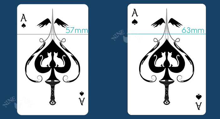
‘Bridge’ size is slightly narrower compared to ‘Poker’ size. This gives the card a slightly elongated look, which is partly why I chose this size for the original edition – being closer to the look and feel of tarot cards:
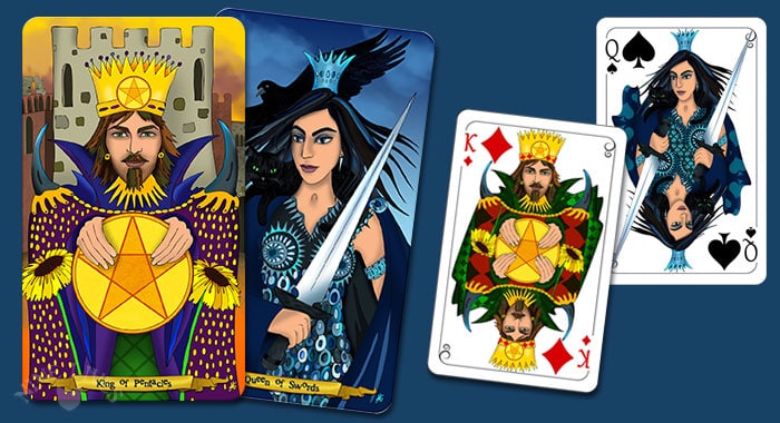
Where the names (Bridge & Poker) serve to differentiate; card sizing seems to relate more to what is common in different parts of the world; some countries use narrow cards, others use wider cards – others again; use a mix of both … I have been told that Bridge players prefer the narrow card, as it is easier to comfortably hold more cards in your hand, but as with all treasures, preferences are highly subjective :)
Card Stock and Texture
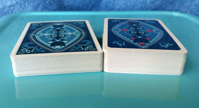
A side-by-side comparison of the two decks with poker size on the left and bridge size on the right.
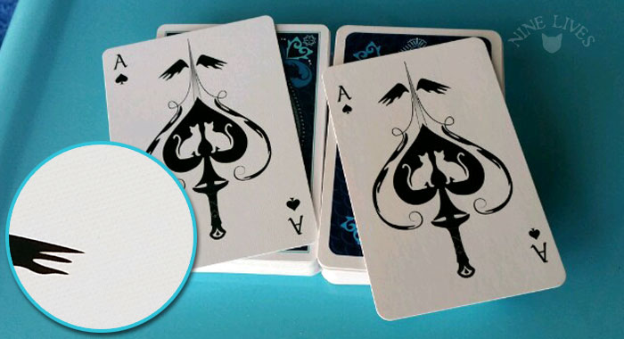
I tried to take a photo that shows the subtle texture in the poker size edition card (it’s like a soft linen feel, without obvious grooves if that makes sense), which gives the cards a lovely glide (not too slippery). The bridge size cards are printed on 300gsm smooth card stock and have a sturdy, slightly waxy feel.
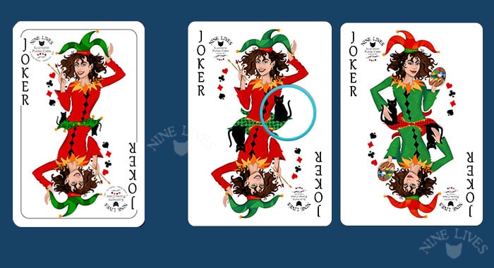
The Jokers
In the first edition you will find two identical Jokers, whereas the new edition has two individual Jokers. These ‘jokerish’ characters represent artist and cat, namely myself and our most adored and entertaining black cat, Filemon. Note that the second edition reflects his growth spurt from kitten to cat.
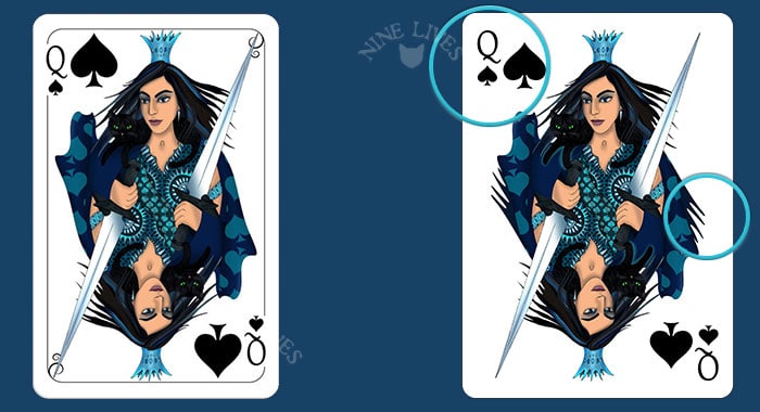
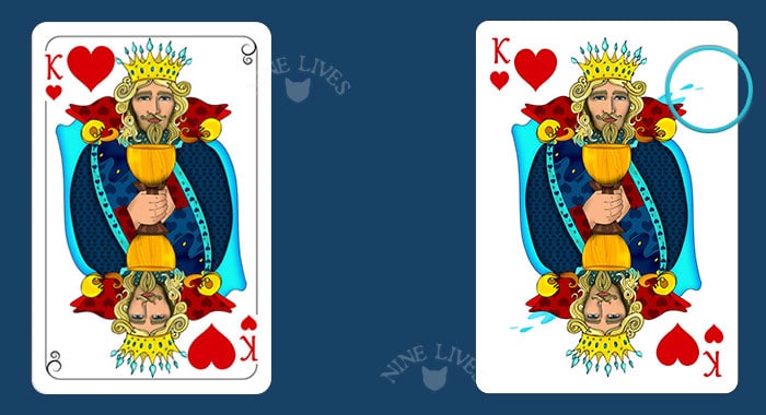
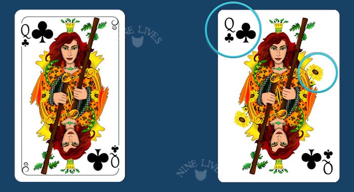
The Courts
The first edition frames the courts inside what is known as ‘peek-friendly’ borders. A style common in parts of Europe where border placement provides a layer of suspense when peeking at your cards. The second edition has no borders and the indices have moved to reflect this change, which allows more space around the artwork. I also made use of the wider card size and introduced additions to the royal wardrobe:
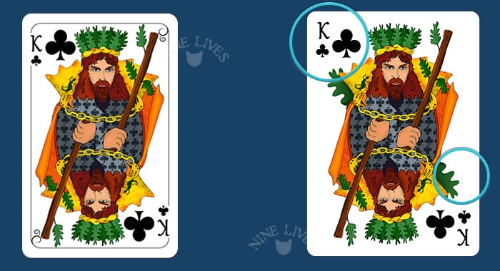
Knights vs Jacks
I have a soft spot for Knights, which is why they figure in the first edition paying homage to their tarot persona. The second edition introduces Jacks – known for bringing fairness to the card table … Equally chivalrous, these characters are eager to conquer hearts and minds alike:
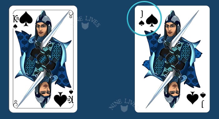
The Number Cards
Both decks feature custom designed pips, slightly larger in the second edition to make use of the wider card. Size and position of the indices varies a little between the two decks as well:
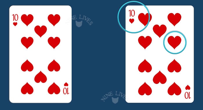
The Back Design
First edition features a slightly darker blue theme, with red accents included on card symbols in the centre. The second edition has more detail (especially in the corners, which look really cool when fanned), straight corners, and a dark to light blue theme, contrasted by the black in spades and cats.
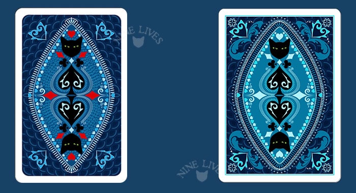
Packaged inside a little Box …
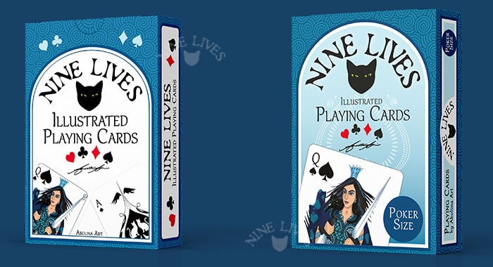
While similar, the two tuckboxes have variations to allow clear differentiation between the two editions:
Read, Play, Collect …
In this post I have put together a long list of fun things you can do with a deck of cards. Well worth checking out for a rainy day or a journey:
I hope you enjoyed this comparison post – next time I’ll share some readings comparing playing cards and tarot.
Thank you for visiting!
Annette :)


The new deck looks wonderful and the slight differences will make it acceptable to deck collectors. I really appreciate the fact that you included this segment so that comparisons could be made more easily. Good luck with this wonderful venture.
Thank you so much Hilary
Your good wishes mean a lot too :)
Great post, Annette. I have both decks, so now I will be spending some time comparing them… personally, I love both of them.
Thank you Diane – that is great to hear :)